Enter password to view case study
overview
A scalable design system built to support a 0→1, evolving & growing marketplace.
I led the design and implementation of Nearville’s design system from 0→1, establishing a scalable foundation to support rapid product development across a growing marketplace platform.
40 %
in duplicated design work through reusable components and standardized patterns.
60 %
faster design workflows enabled by component reuse and clearer system structure.
50 %
of features built and implemented by engineers in 1st month using design system components.
2 x
build cycles enabled by clear documentation and tighter integration between design (Figma MCP).
PROBLEM SPACE
Speed created fragmentation
The mobility system supported a private community of ~300 people, helping them move between locations throughout the day. But behind the scenes, it relied on fragmented tools and manual coordination.
3 designers working in parallel
4-6 months of rapid iteration and experimentation
Components pulled from existing systems without standardization
Inconsistent design patterns across similar features
Design/dev handoff required more interpretation
Increased back-and-forth and rework
As a result, the team began to lose momentum at a critical stage:
Slower, less predictable build cycles
Limited trust in a newly launched product due to inconsistent experiences
Design unable to support long-term product growth
At a stage where momentum is critical to product reliability and growth, this fragmentation became a bottleneck.
DISCOVERY
Auditing inconsistencies across the product
I audited existing product flows to understand how inconsistencies formed—identifying where patterns diverged, where duplication occurred, and how this impacted both user experience and team workflows.
A bird’s-eye view to identify inconsistencies across use cases
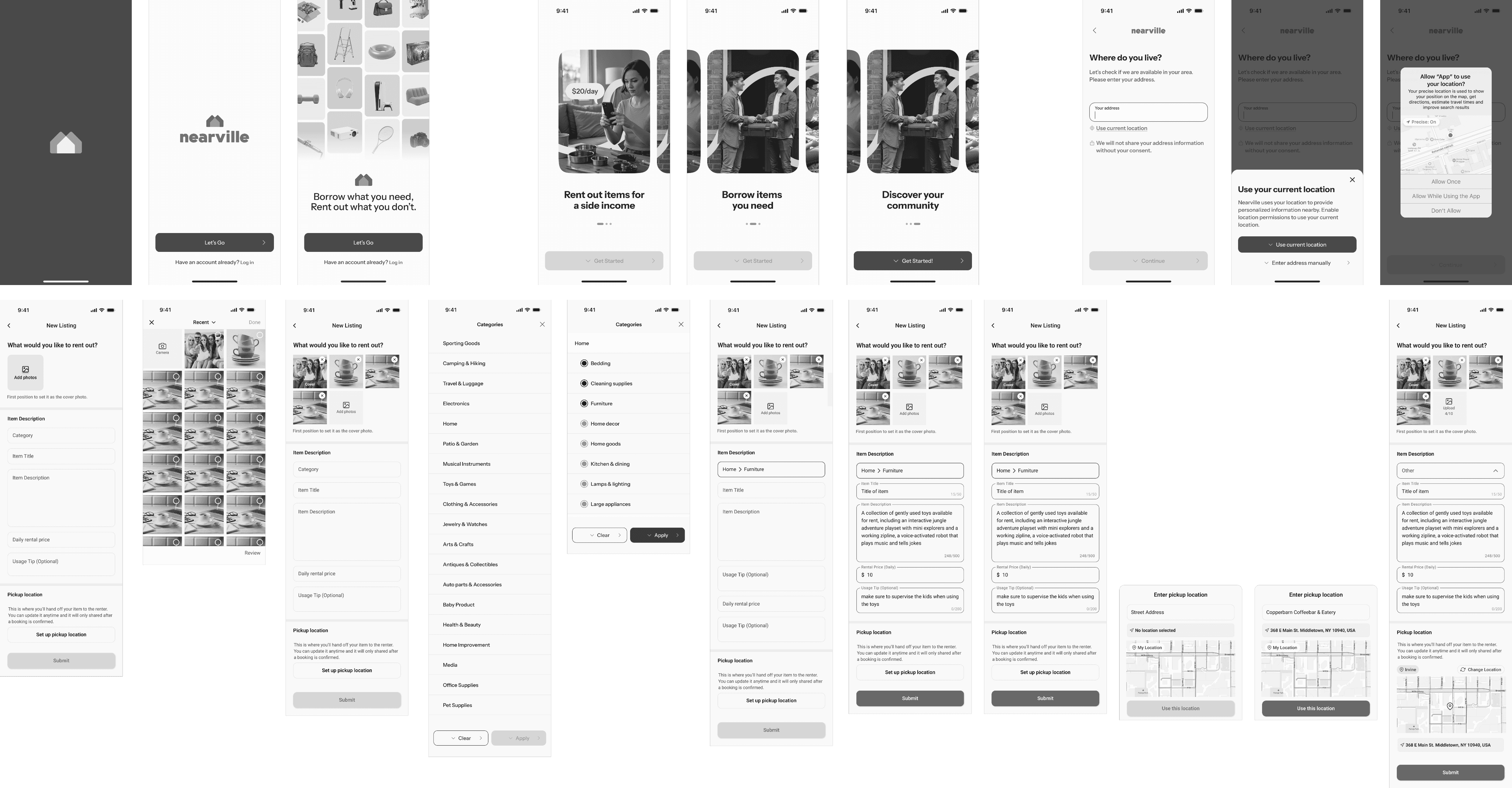
Key inconsistencies spotted
PROCESS
Building the system through continuous iteration
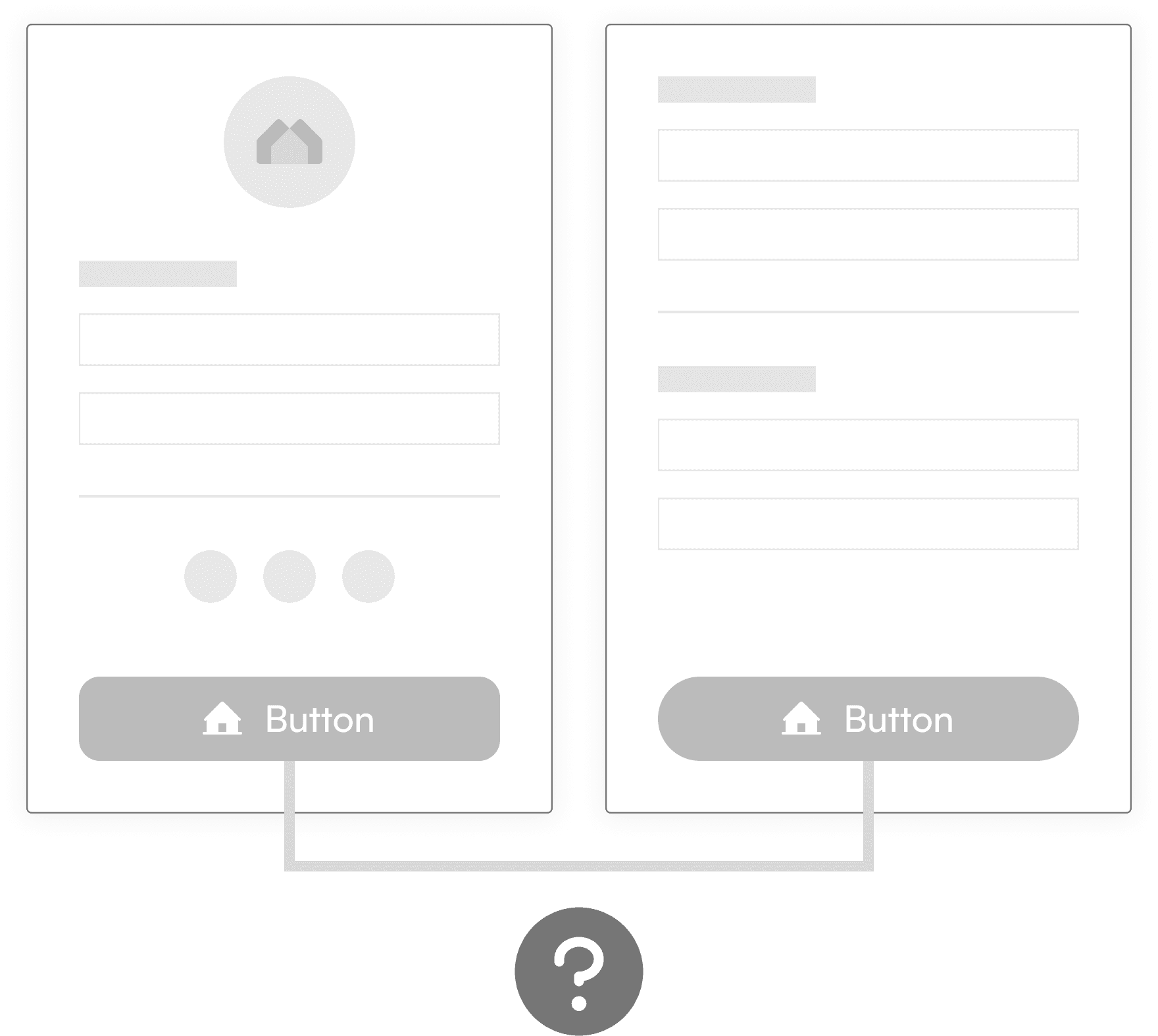
The system was developed through tight loops of building, feedback, and iteration—while product exploration and brand updates were happening in parallel. Each decision was shaped by real usage, not predefined assumptions.
Atomic Design
Iterations in practice
Each iteration looped in designer and engineer feedback, validating real usage while considering scalability, helping the system become more practical and aligned over time.
Typography
Redefined after identifying inconsistent usage across experiences, reclassifying styles and simplifying the system based on real usage.
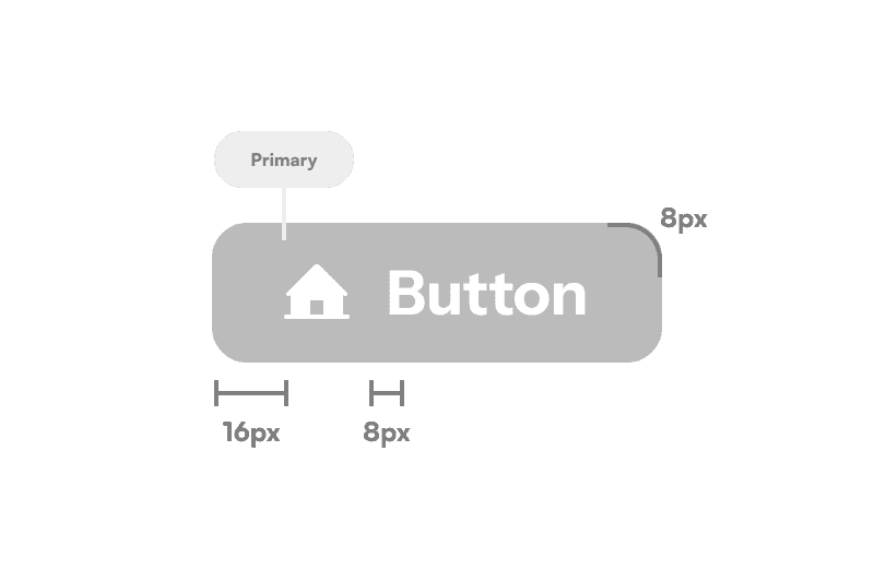
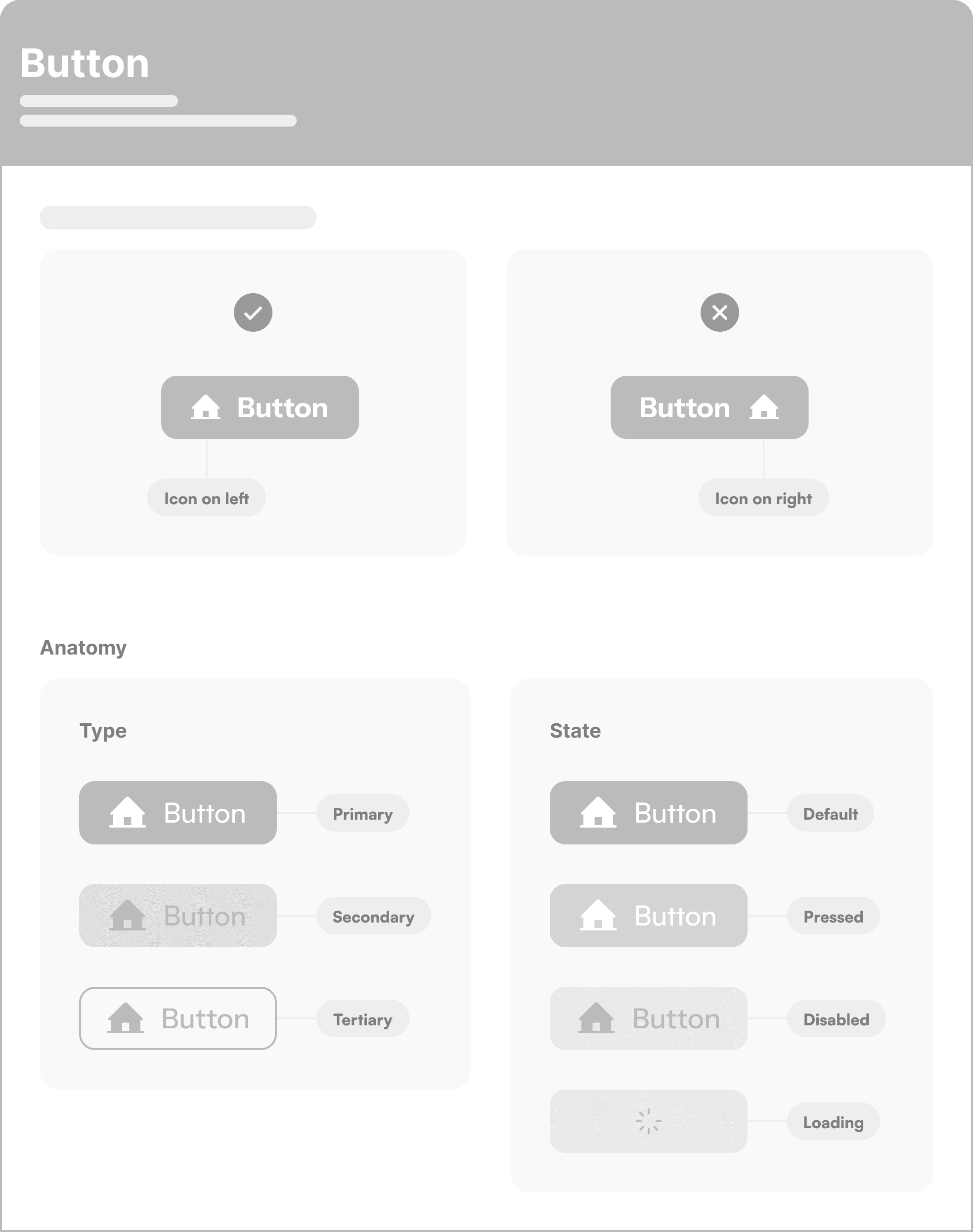
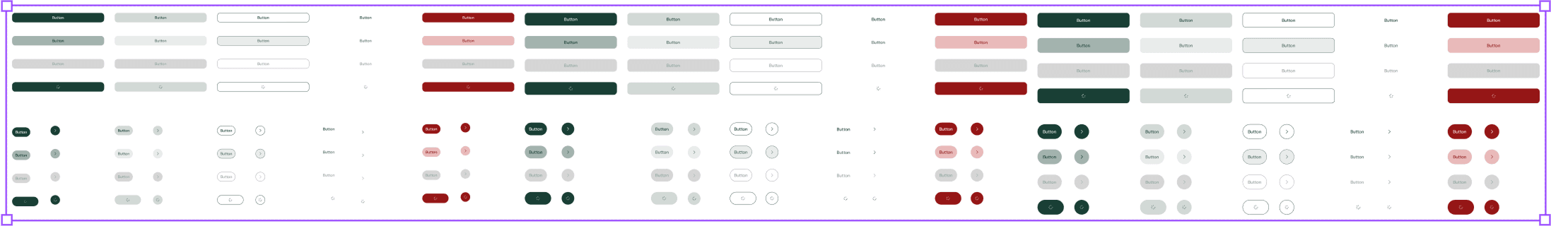
Buttons
Initially expanded to a complex set to support design explorations but later refined to a simpler version that strongly aligns with new product direction.
Original
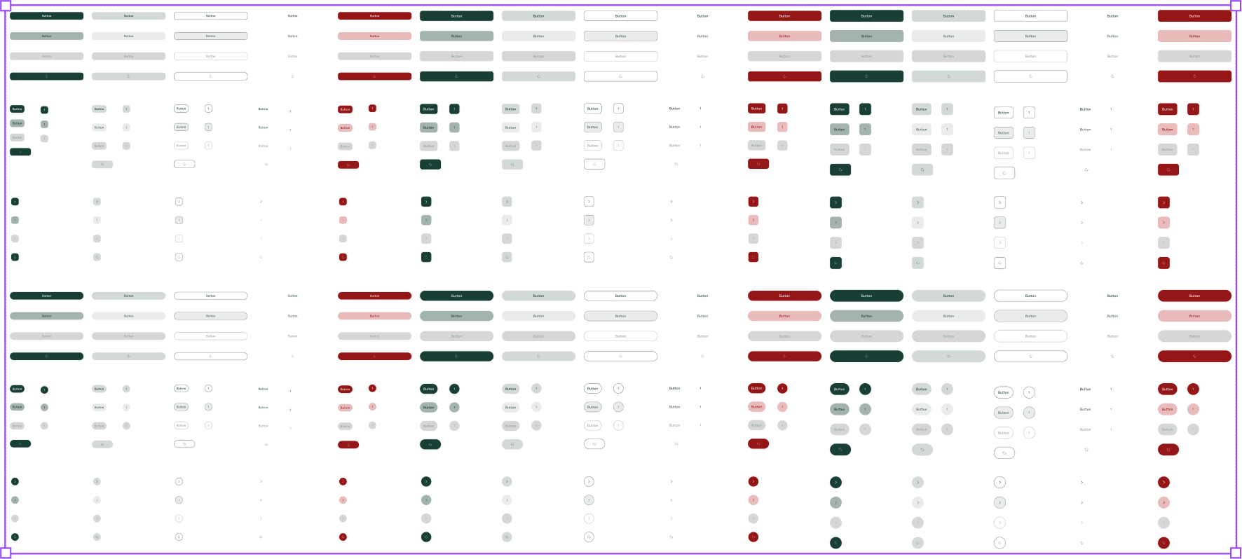
450 Variants
New
180 Variants
KEY DECISIONS
Not every component needed the same level of structure
As the system matured, the goal wasn’t to standardize everything equally. Some components needed stricter rules to protect accuracy and trust, while others needed more flexibility to support rapid iteration.
I focused on introducing structure where inconsistency created the most risk, while leaving room for exploration in lower-risk areas.
Here’s a framework I used to evaluate where to introduce structure vs. flexibility.
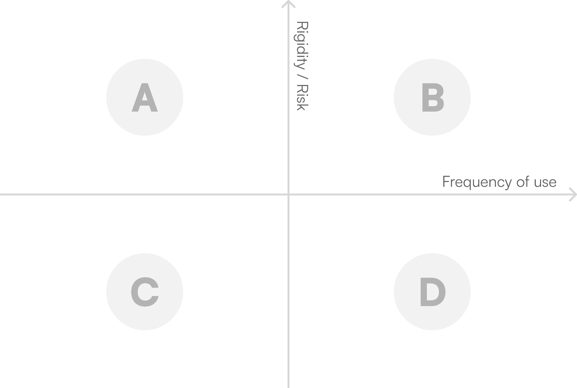
A
Low frequency, high risk
e.g. cancellation, policies
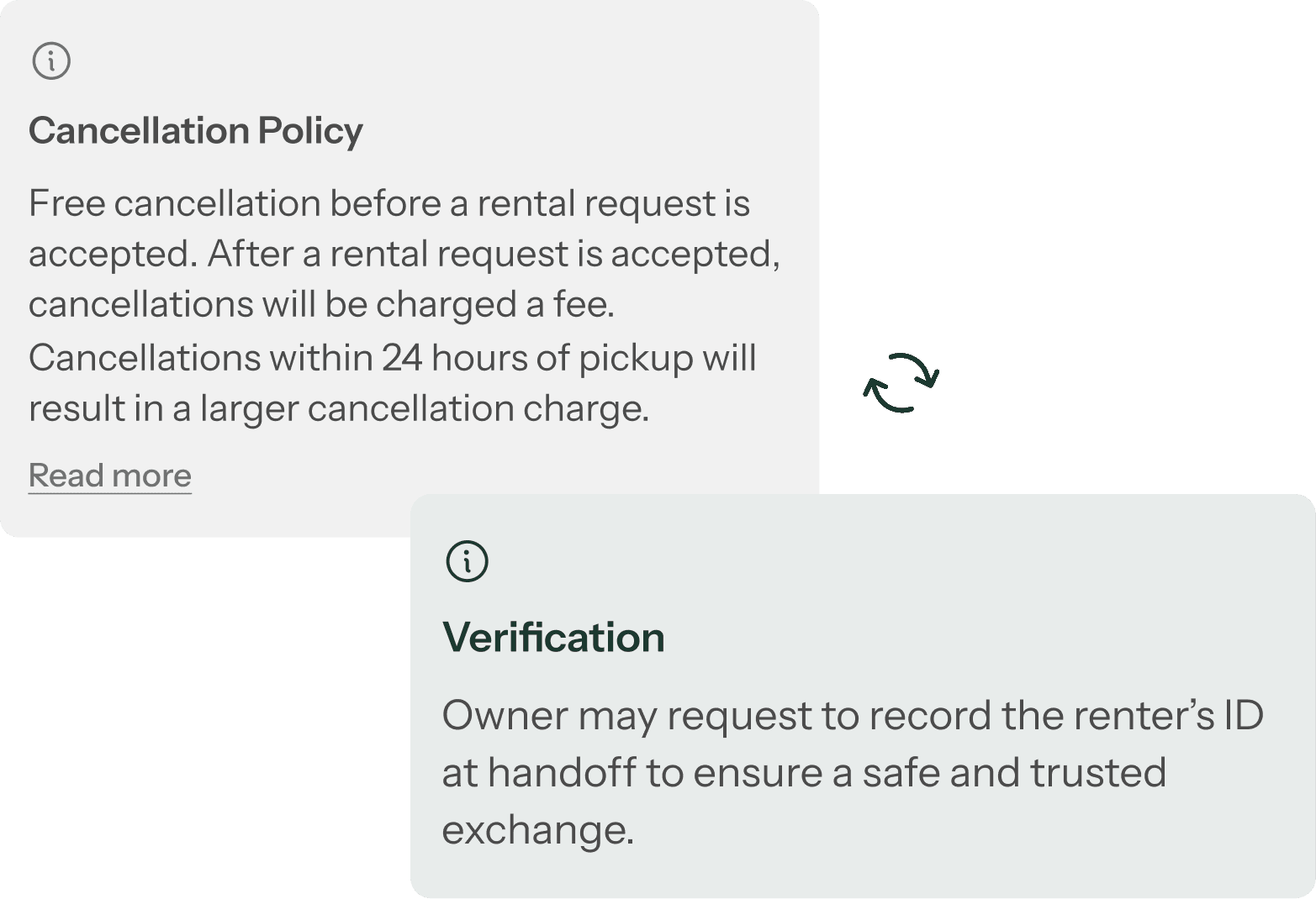
Fixed copy to ensure accuracy and compliance
Structured variants (e.g. policy types) instead of custom inputs
B
High frequency, high risk
e.g. payment-related
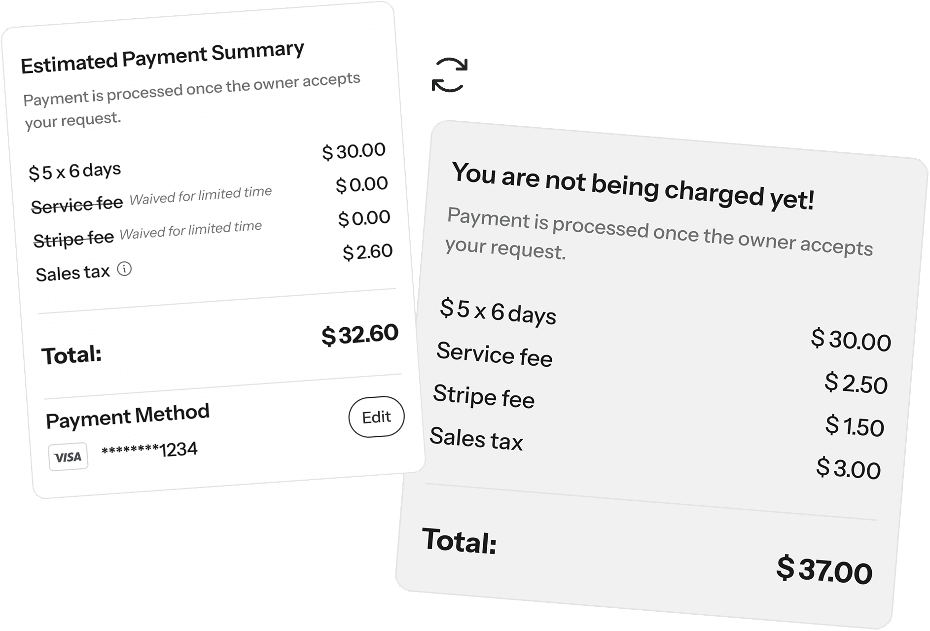
Locked structure and labels to ensure consistency and trust
Configurable $ values within predefined fields
Toggleable line items to support different pricing scenarios
C
Low frequency, low risk
e.g. pop-up messages
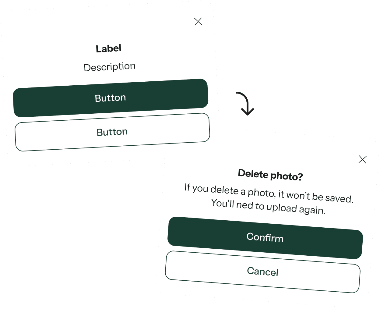
Toggleable line items to support different pricing scenarios
Editable label, description, and button text
Minimal constraints to avoid over-systemizing early
D
High frequency, low risk
e.g. navigation bar
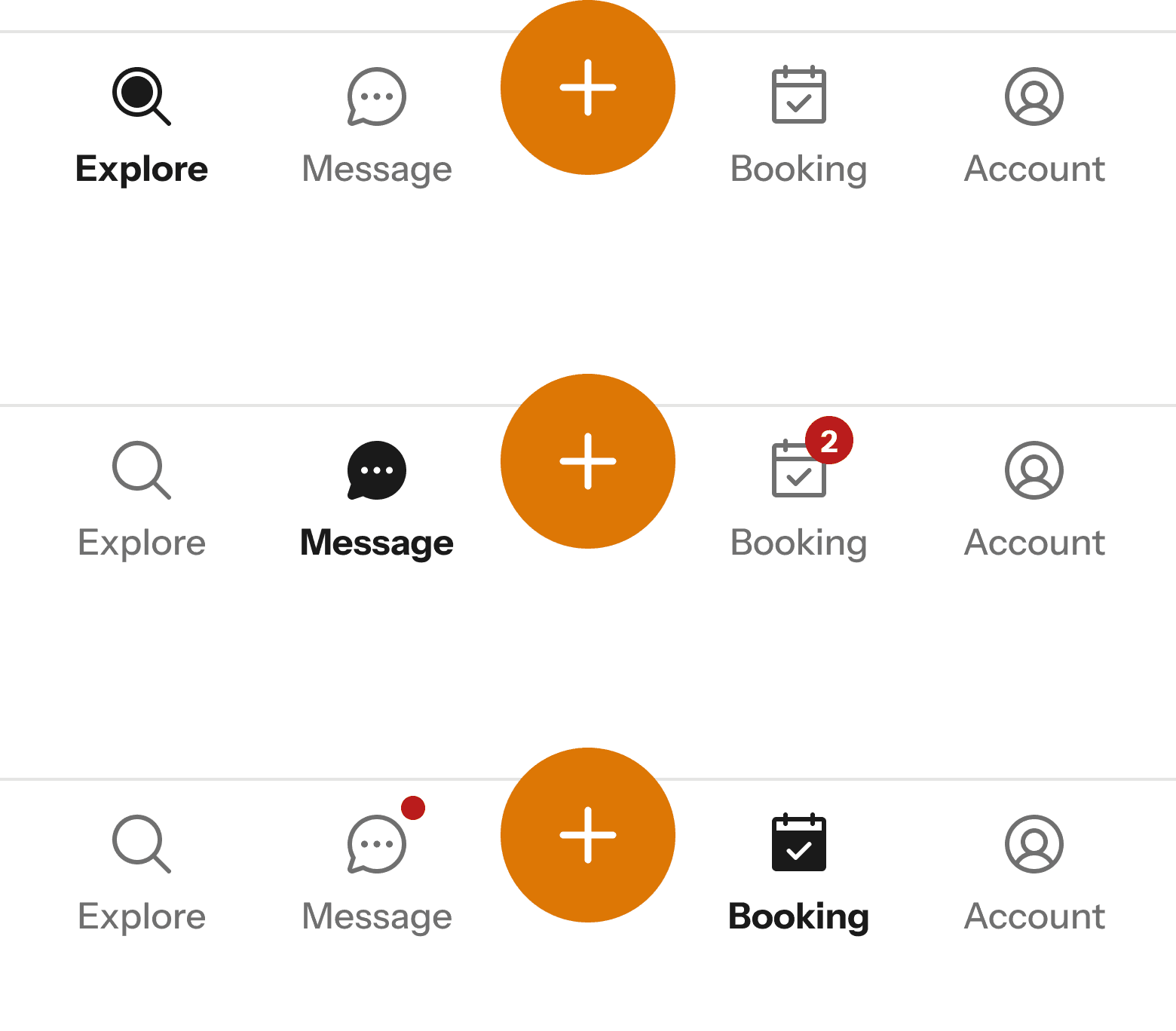
Standardized structure for consistency across screens
Configurable states (default, active, unread indicators)
Support for variations (icon, label, badge types)
FINAL DELIVERY
A scalable system built for consistency and speed
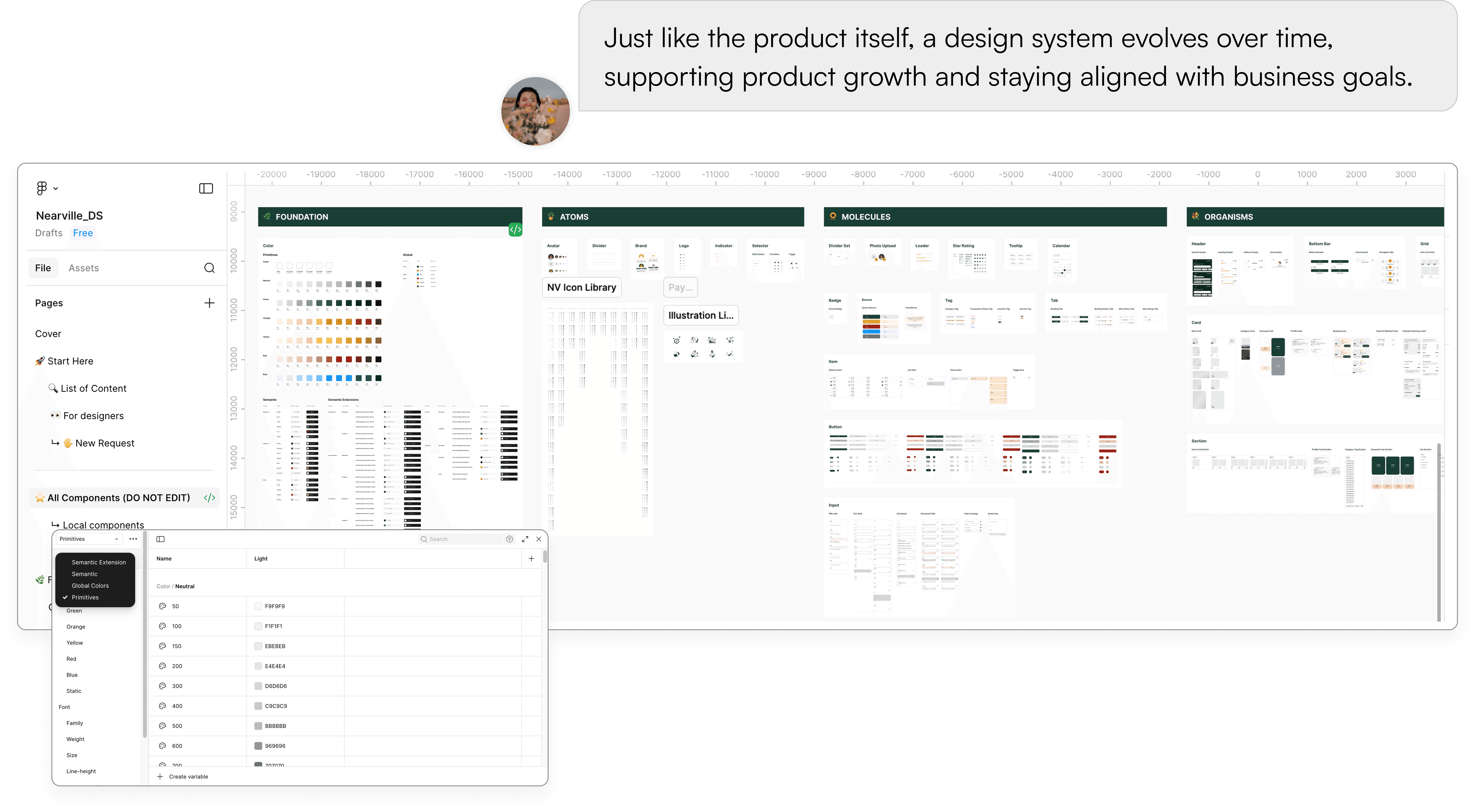
Design System
A living system consisting of 500+ components and variants
The system evolved into a robust foundation, enabling consistent experiences and supporting ongoing product development.
Documentation
Helping designers design with ease and engineers build with confidence

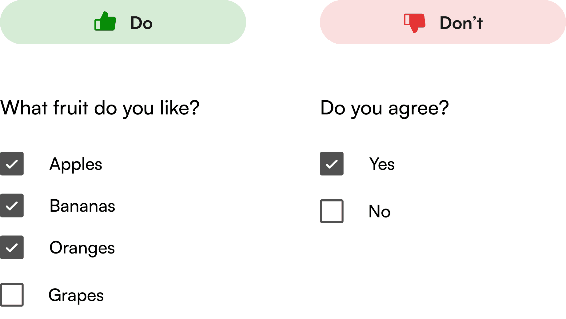
Defining component anatomy and use cases
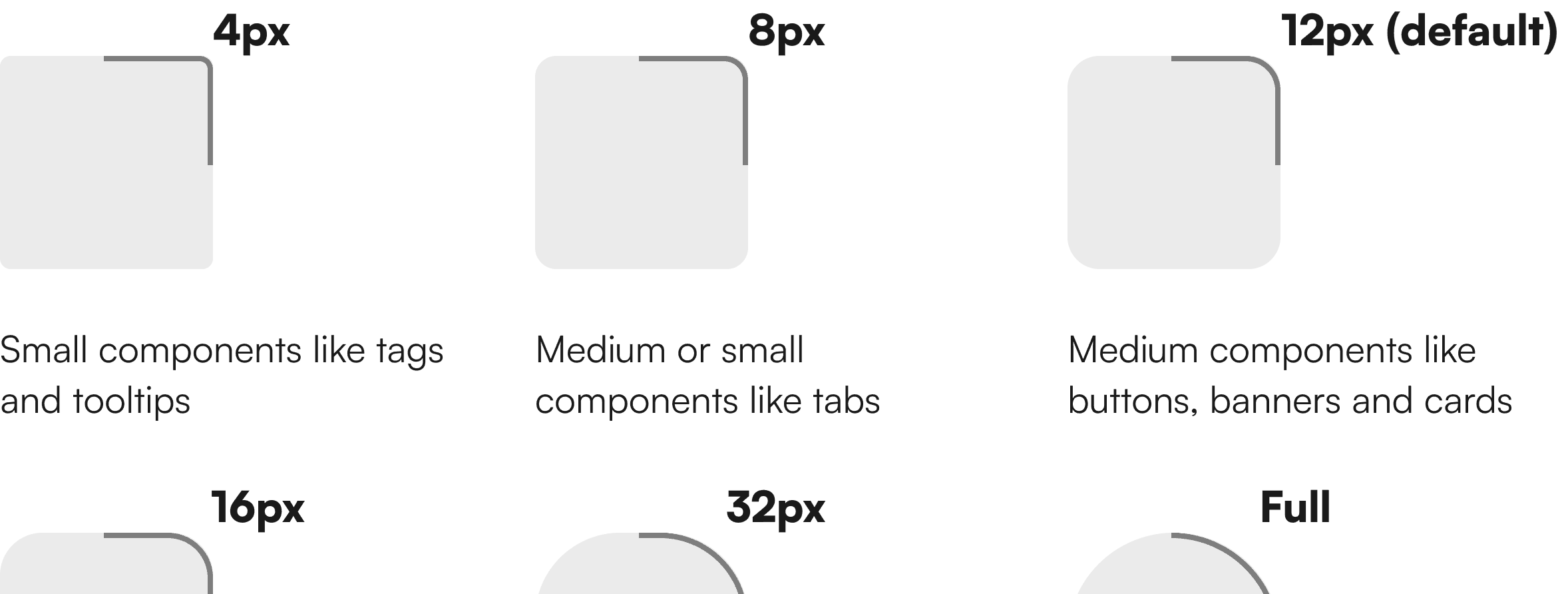
Radius
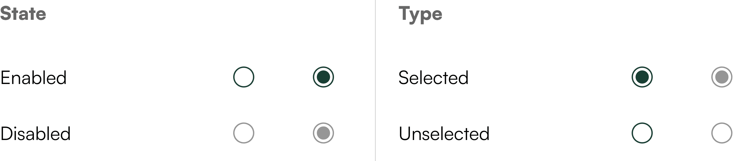
Radio Button
Establishing intuitive naming conventions
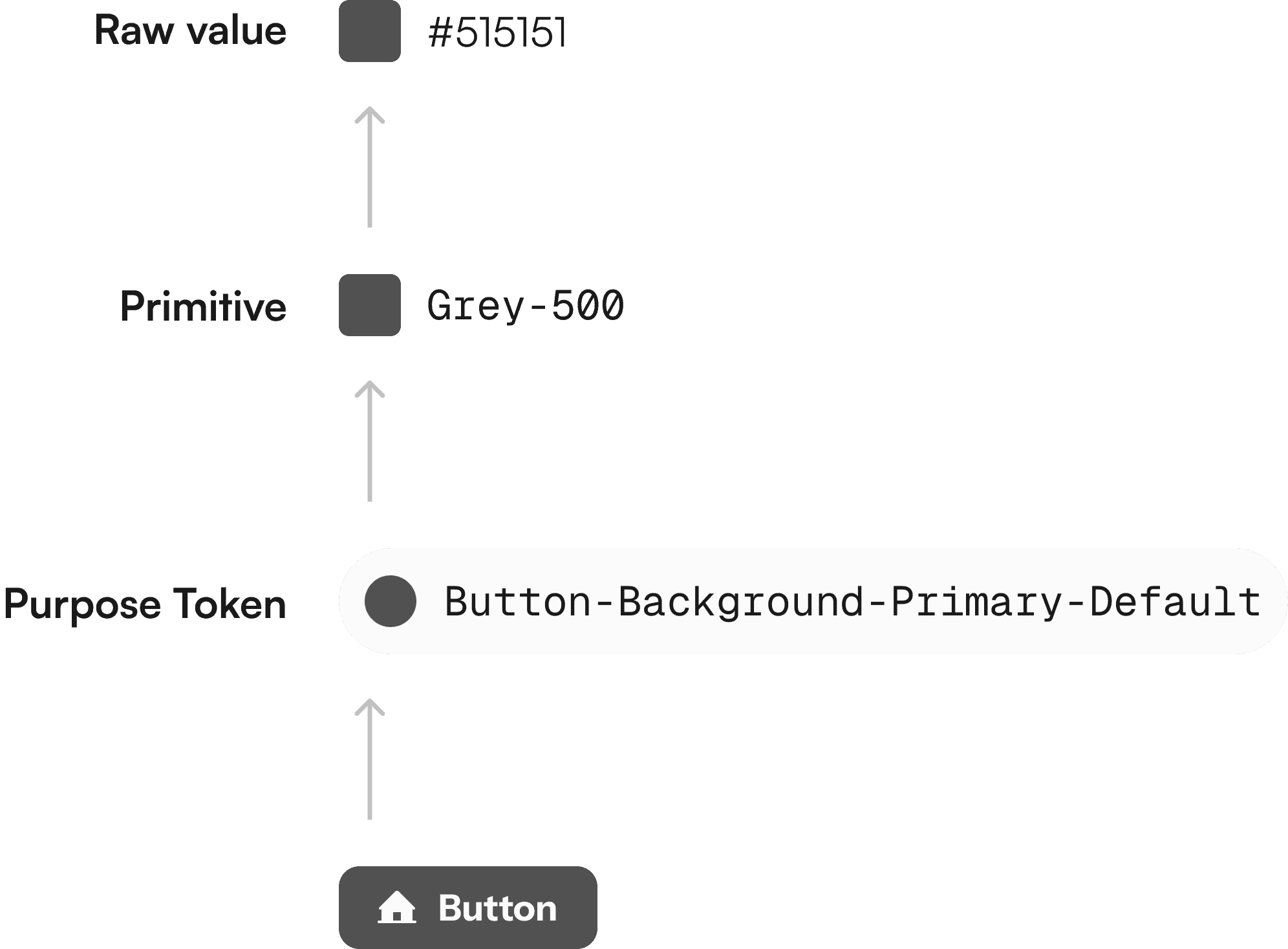
Color
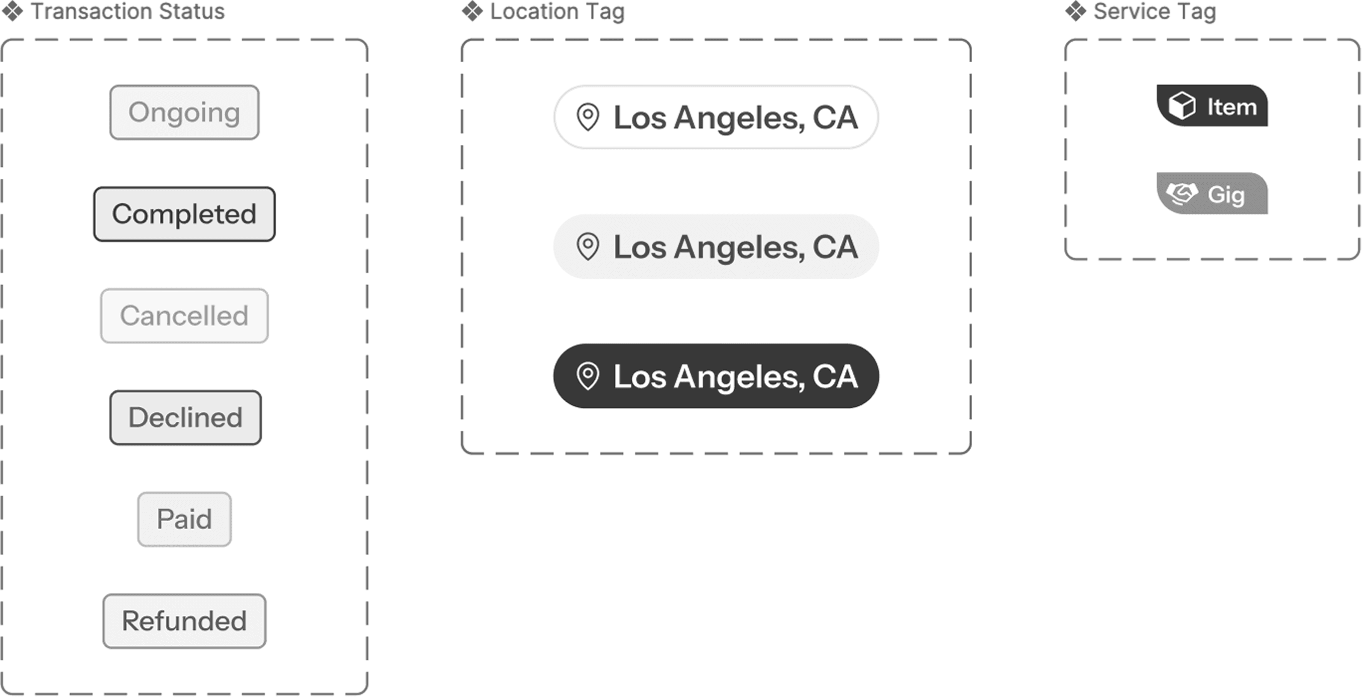
Tags
Providing usage examples, dos/don'ts
Button (loading state)
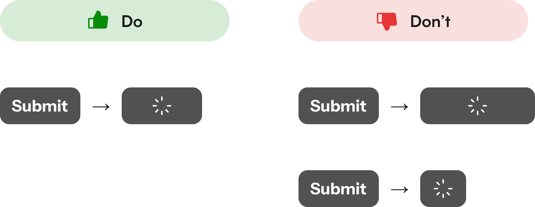
Checkbox
FINAL THOUGHTS
Balancing structure and flexibility to build systems that scale with the product
WHAT I LEARNED
Design systems evolve, alongside the product itself
A design system is a product in itself, with designers and engineers as its users. As an internal tool, it benefits from fast feedback loops, allowing it to evolve alongside the product.
Working closely with engineering to understand what matters - clear specs, naming, and structure, is key. Good documentation not only improves communication, but also makes the system easier to interpret by tools, speeding up implementation.
This was a great opportunity to apply systems thinking to bring clarity to a fast-moving product.
WHAT'S NEXT
Finding new ways of working
The engineering team has started adopting the system, reaching ~50% adoption within the first week, an early signal that it’s practical and aligned with real workflows.
Exploring how tools like Figma MCP and other AI workflows can speed up the design-to-development cycle—reinforcing the need for a well-structured, machine-readable system.
Not every product or team requires the same level of system maturity. Moving forward, I’d focus more on calibrating the right level of structure based on context, and aligning earlier with stakeholders on what that should look like.
As of Feb 2026, the team made the decision to discontinue Nearville.
