Enter password to view case study

WEB DESIGN・2025
A higher-ed website re-architected to improve clarity and navigation.
Lead UX Designer
3 months
Education
Web & Mobile
B2C
overview
Re-architecturing a 60 page college website to help current and potential students and parents get info they need.
I led the end-to-end design and re-architecture of a college website, including everything from stakeholder management, user interviews, design ideations, non-code development, QA and delivery.
TIME ON SITE
2 x
PAGES PER SESSION
2 x
BOUNCE RATE
16 %
DAILY AVERAGE VISIT
123 %
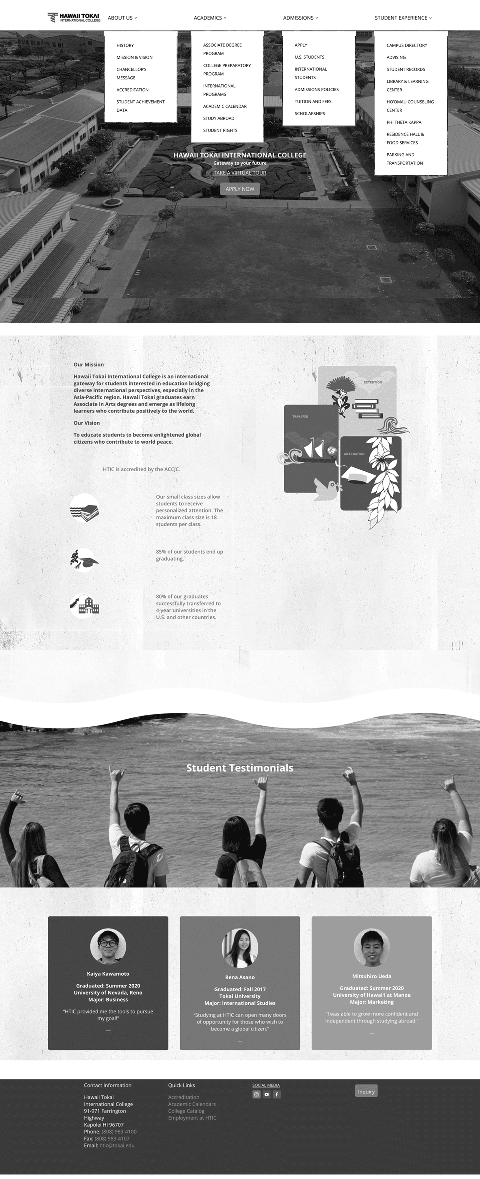
Landing Page BEFORE
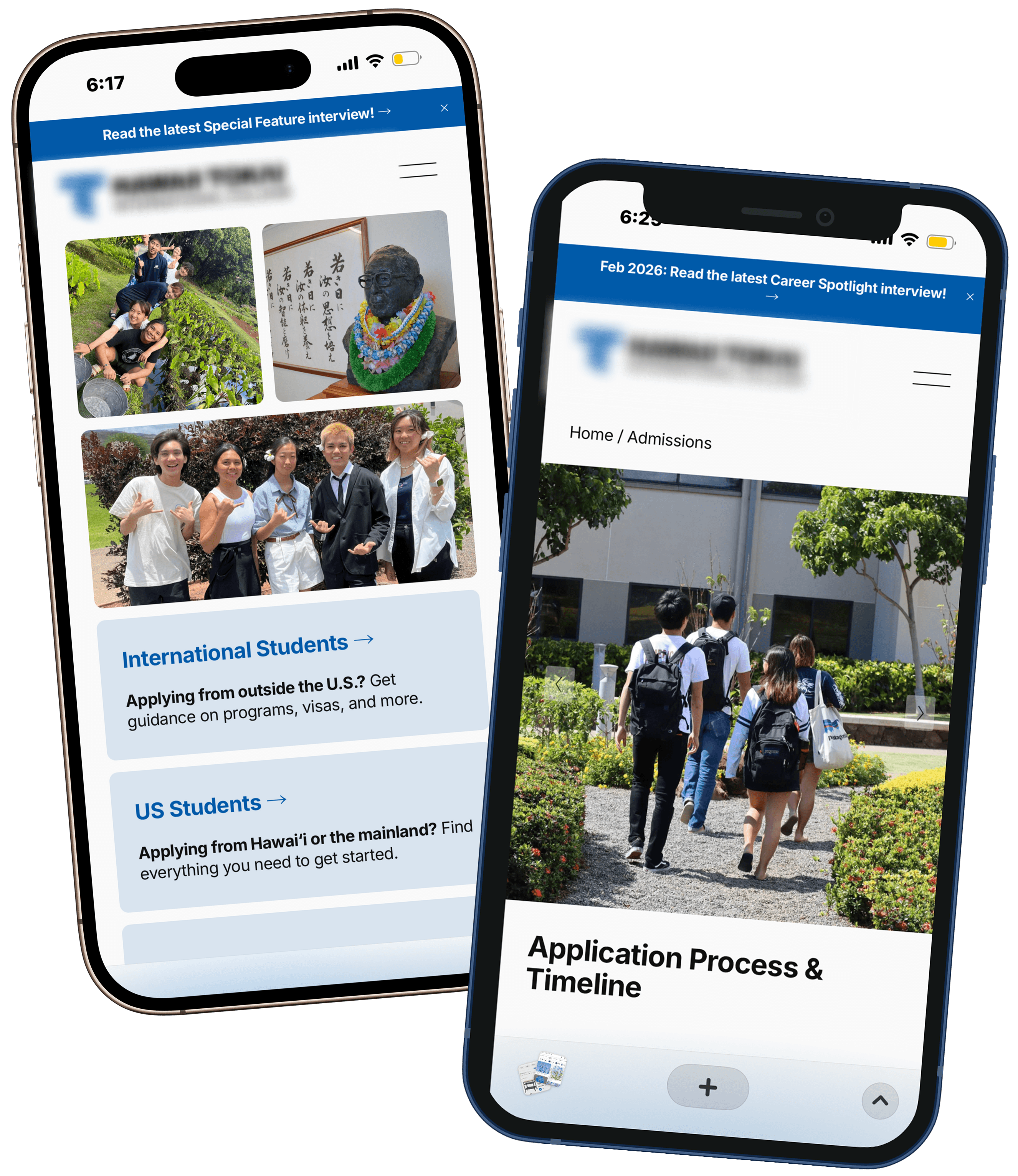
Landing Page AFTER
PROBLEM SPACE
A website that could not keep up with evolving needs
he college website had been continuously updated with critical information, such as admission deadlines and program details, but had not been re-architected in close to a decade.
With no clear documentation or ownership clarity, the team struggled to maintain and evolve the site. Over time, content was frequently removed to reduce complexity, resulting in a thin, fragmented experience with limited information and unclear messaging.
BUSINESS IMPLICATIONS
The lack of structure and clear ownership led to inconsistent messaging and a weakened digital presence.
Outdated or incomplete information reduced trust with prospective students
Unclear messaging made it difficult to communicate the school’s value
Fragmented experience increased drop-off during exploration
Negative impact on student recruitment and faculty hiring
To better understand the problem space, I spoke with current students, faculty and staff to understand their experiences and perspectives.

DISCOVERY
67% of users expressed frustration with unclear or outdated information
Across interviews, users consistently struggled to find accurate and up-to-date information. Missing details, outdated content, and unclear messaging made it difficult to trust the website as a reliable source, often forcing users to seek answers elsewhere.
"I looked at the website before enrolling, but the transfer information was confusing and didn’t show which partner schools were actually possible."
43%
of current students visited before enrolling
67%
frustrated by missing/outdated info
“I tried to find details about the dorms (like what to bring or what’s provided) but that information wasn’t there.”
42 sec
avg. time on site
47%
bounce rate
1.8 pages
per session

USER PROBLEM
How might we help prospective students and families navigate easily so that they can find what they need without confusion?
Let's align user needs with business goals.
PRIORITIZATION
Stakeholders had competing priorities.
“We need to update the content. What’s there now is outdated.”
The site is too thin, we need more content overall.”
“The backend is messy and difficult to maintain.”
Looking into data, relative to traffic, engagement was low.
Traffic was unexpectedly strong, indicating a critical touchpoint in their decision-making journey.
95%
43%
But engagement had a different story, where users weren't spending too much time.
42 sec
1.8 pages
47%
In order to ensure meaninful progress, I introduced a phased roadmap to align user needs with business goals.

Let's re-focus the HMW statement.

NEW USER PROBLEM
How might we help users quickly find relevant, reliable information so they stay engaged and move forward with confidence?
PROCESS
Designing with clarity, structure, and iteration
Given the complexity of multiple stakeholders and unclear information structures, I focused on a process that prioritized early alignment and continuous iteration to ensure decisions stayed grounded and impactful.
Audit
Identify key usability, content, and structural gaps impacting engagement
Strategize & Ideate
Define direction and positioning through research and cross-site analysis
Test & Iterate
Validate ideas through testing and refined the experience based on user behavior

Design Audit
Landing page (before)


Strategize & Ideate

Positioning Map

Test & Iterate
This project required designing for two distinct audiences.

Landing page (after)

CHALLENGE
Operating in a regulated, multi-stakeholder environment
Here's more info about the dynamic of the team.
This means layers of approvals.
I brought some structure for alignment and execution.
To move efficiently within this environment, I established a system to align stakeholders and maintain momentum:
STRATEGY WORKSHOP

Having a shared understanding of current state and aligning early with executives on priorities, scope, and decision-making criteria to reduce downstream conflicts.
SHARED VISIBILITY

Used a centralized Gantt chart to track tasks, dependencies, and deadlines—giving all stakeholders visibility into progress and ownership.
SHARED DECISION-MAKING

Facilitated decision reviews with key stakeholders—presenting options, gathering feedback, and driving alignment at critical milestones.
CLEAR OWNERSHIP & ACCOUNTABILITY

Defined what each department needed to review, by when, and for what purpose—ensuring feedback was focused and actionable.
FINAL DELIVERY
A redesigned website with clear pathways and audience-specific experiences
Measured Outcomes
The redesigned experience led to measurable improvements in user engagement and site performance.
TIME ON SITE
2 x
42s → 95s
BOUNCE RATE
16 %
40% → 40%
PAGES PER SESSION
2 x
1.8 → 3.9
DAILY AVERAGE VISIT
123 %
(42.7/day → 95.3/day)
Business Impact
Beyond usability improvements, the project delivered measurable business impact through reduced operational costs and more efficient workflows.
ANNUAL SUBSCRIPTION
49 %
$564/yr → $288/yr
Stakeholder Reflections
I want to express my deepest gratitude to you as well! It was a very fulfilling project to be a part of, and I have learned so much from you… and I am also happy to have made it this far and to have gone on this journey with such a skilled professional such as yourself. Looking forward to polishing the website going forward.
Mahalo Nui Loa,
Liaison @ HTIC
Mahalo nui to you and everyone who worked on this. It looks great and we really appreciate all your hard work!
Faculty @ HTIC
FINAL THOUGHTS
Designing in a regulated environment requires balancing accuracy with clarity and engagement
WHAT I LEARNED
Building strong alignment with all collaborators
Shared visibility for alignemnt
Making work, timelines, and dependencies visible across teams helped reduce ambiguity and enabled stakeholders to take ownership of their contributions.
Involving stakeholders at key moments
Bringing the right stakeholders into defined decision points kept feedback focused, reduced rework, and enabled faster, more confident decisions.
WHAT'S NEXT
Scaling the system for long-term governance
Strengthen governance
Establish clearer ownership and processes to ensure content remains accurate, up-to-date, and aligned as the site evolves.
Expand the system
Continue evolving the platform to better serve additional user groups, including current students, alumni, and internal stakeholders.


